UIKit15 min readMay 30, 2026

Mastering UIKit: Your Essential Guide to iOS App Development

UIKit is the cornerstone of iOS app development, providing the fundamental components and infrastructure for building rich, interactive user interfaces. This guide will introduce you to its core concepts, allowing you to create robust and responsive applications for Apple's mobile platforms. Discover how to leverage UIKit to bring your app ideas to life.

Mastering UIKit: Your Essential Guide to iOS App Development

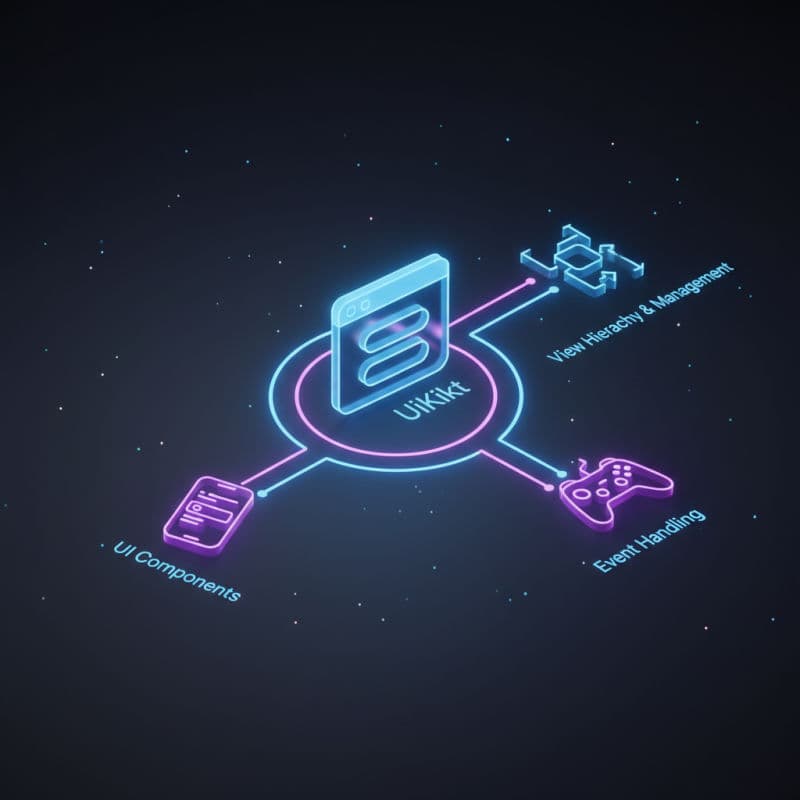
What is UIKit and Why is it Essential for iOS?

UIKit is Apple's primary framework for constructing and managing the user interface of iOS applications. It provides the core infrastructure for drawing and managing views, handling events, and interacting with the system. While SwiftUI has emerged as a powerful declarative alternative, UIKit remains absolutely essential. Many existing apps are built with UIKit, and understanding it gives you a deeper insight into how iOS works under the hood. Furthermore, SwiftUI often interoperates with UIKit, and you'll find yourself needing to embed UIKit views within SwiftUI or vice-versa, especially when leveraging specific features or third-party libraries not yet fully supported by SwiftUI.

UIKit encompasses a vast collection of classes and protocols that define the visual and interactive elements of your app. From buttons and labels to complex table views and navigation controllers, UIKit offers a rich toolkit for crafting intuitive user experiences. It's built upon the Core Animation and Core Graphics frameworks, which handle the heavy lifting of rendering and drawing efficiently. By providing a higher-level abstraction, UIKit allows developers to focus on application logic rather than low-level graphics programming.

When developing for iOS, understanding UIKit is not just about building apps; it's about understanding the core language of interaction on Apple's mobile devices. Whether you're building a new app or maintaining an existing one, UIKit provides the stability, performance, and flexibility needed to deliver high-quality user experiences. It is compatible with all iOS versions where app development is supported, typically back to iOS 10.0 for modern Swift development, though specific features might require newer versions.

The Core Components of a UIKit Application

At the heart of every UIKit application are several key components that work together to present content and respond to user input. Understanding these components is crucial for building well-structured and maintainable iOS apps.

UIApplication and AppDelegate

UIApplication is the central control object that manages the shared behaviors of your app. It handles the initial setup, processes incoming events (like touch events or remote notifications), and coordinates with the system. You rarely interact with UIApplication directly, but its delegate, UIApplicationDelegate, is where your app's lifecycle events are managed. The AppDelegate class is your entry point for handling events such as app launch, termination, backgrounding, and foregrounding—critical moments in an app's journey.

UIWindow

A UIWindow object provides the surface on which your app's content is drawn. Every iOS app has at least one key window, which acts as the container for all your app's visible content. Windows don't have any visible content themselves; they simply define the area where your views will appear. You typically don't create or manage UIWindow instances directly beyond initial setup in modern scenes-based apps, as the system handles it, but it's an essential underlying component.

UIViewController

UIViewController is arguably the most important component in UIKit for organizing your app's UI. A view controller manages a hierarchy of views for a specific screen or section of your user interface. It acts as the intermediary between your data (model) and your views, handling user input, updating the view when data changes, and managing the lifecycle of its associated views. View controllers are responsible for tasks like presenting other view controllers, responding to device rotation, and managing memory. They are a central part of the Model-View-Controller (MVC) design pattern, which is prevalent in UIKit.

Here's a basic UIViewController subclass example, which you'd typically define in its own '.swift' file:

swift
import UIKit

class ViewController: UIViewController {

    override func viewDidLoad() {
        super.viewDidLoad()
        // Do any additional setup after loading the view.
        
        // Set the background color of the view
        view.backgroundColor = .systemMint
        
        // Create a UILabel
        let greetingLabel = UILabel()
        greetingLabel.text = "Hello, UIKit!"
        greetingLabel.textColor = .white
        greetingLabel.font = UIFont.systemFont(ofSize: 24, weight: .bold)
        greetingLabel.textAlignment = .center
        
        // Add the label to the view's hierarchy
        view.addSubview(greetingLabel)
        
        // Disable translatesAutoresizingMaskIntoConstraints for manual layout
        greetingLabel.translatesAutoresizingMaskIntoConstraints = false
        
        // Activate constraints to center the label
        NSLayoutConstraint.activate([
            greetingLabel.centerXAnchor.constraint(equalTo: view.centerXAnchor),
            greetingLabel.centerYAnchor.constraint(equalTo: view.centerYAnchor)
        ])
    }

    override func viewDidAppear(_ animated: Bool) {
        super.viewDidAppear(animated)
        print("View did appear on screen")
    }
    
    override func viewWillDisappear(_ animated: Bool) {
        super.viewWillDisappear(animated)
        print("View will disappear from screen")
    }
}

Understanding Views and Auto Layout

UIView

At the most granular level, UIView is the base class for all visual elements in UIKit. Buttons, labels, text fields, images – all these are subclasses of UIView. A UIView object defines a rectangular area on the screen and is responsible for drawing its content within that area. Views can be nested to create complex hierarchies, with child views (subviews) drawing on top of their parent views (superviews). You can customize a view's appearance by setting properties like backgroundColor, alpha, isHidden, and by overriding its draw(_:) method for custom drawing.

Auto Layout

To ensure your app's interface adapts gracefully to different screen sizes, orientations, and device types, UIKit relies heavily on Auto Layout. Auto Layout is a constraint-based layout engine that allows you to define rules (constraints) that dictate the position and size of your views relative to each other or to their superview. Instead of specifying fixed frames, you define relationships like "this button's leading edge should be 20 points from its superview's leading edge," or "this label should be horizontally centered."

Auto Layout becomes incredibly powerful when combined with Size Classes, which allow you to specify different layout rules based on the available space (e.g., compact width, regular height). While you can manage constraints programmatically using NSLayoutConstraint or the more concise NSLayoutAnchor, Interface Builder (Xcode's visual editor) provides a powerful way to set up Auto Layout visually.

Here's an example of setting up constraints programmatically, similar to what you saw in the UIViewController example, but focusing just on adding and constraining a UILabel within a UIView:

swift
import UIKit

class CustomView: UIView {
    
    let titleLabel: UILabel = {
        let label = UILabel()
        label.text = "Welcome!"
        label.textColor = .darkText
        label.font = UIFont.preferredFont(forTextStyle: .title1)
        label.textAlignment = .center
        label.translatesAutoresizingMaskIntoConstraints = false // Important for programmatic Auto Layout
        return label
    }()
    
    let subtitleLabel: UILabel = {
        let label = UILabel()
        label.text = "This is a custom UIView with Auto Layout."
        label.textColor = .secondaryLabel
        label.font = UIFont.preferredFont(forTextStyle: .body)
        label.textAlignment = .center
        label.numberOfLines = 0 // Allow multiple lines
        label.translatesAutoresizingMaskIntoConstraints = false
        return label
    }()

    override init(frame: CGRect) {
        super.init(frame: frame)
        setupView()
    }
    
    required init?(coder: NSCoder) {
        fatalError("init(coder:) has not been implemented")
    }
    
    private func setupView() {
        backgroundColor = .systemBackground
        
        addSubview(titleLabel)
        addSubview(subtitleLabel)
        
        NSLayoutConstraint.activate([
            // Title label constraints
            titleLabel.centerXAnchor.constraint(equalTo: centerXAnchor),
            titleLabel.topAnchor.constraint(equalTo: safeAreaLayoutGuide.topAnchor, constant: 50),
            titleLabel.leadingAnchor.constraint(equalTo: leadingAnchor, constant: 20),
            titleLabel.trailingAnchor.constraint(equalTo: trailingAnchor, constant: -20),
            
            // Subtitle label constraints
            subtitleLabel.centerXAnchor.constraint(equalTo: centerXAnchor),
            subtitleLabel.topAnchor.constraint(equalTo: titleLabel.bottomAnchor, constant: 10),
            subtitleLabel.leadingAnchor.constraint(equalTo: leadingAnchor, constant: 20),
            subtitleLabel.trailingAnchor.constraint(equalTo: trailingAnchor, constant: -20)
        ])
    }
}

// To use this in a UIViewController:
// class MyViewController: UIViewController {
//     override func viewDidLoad() {
//         super.viewDidLoad()
//         let customView = CustomView()
//         customView.translatesAutoresizingMaskIntoConstraints = false
//         view.addSubview(customView)
//         NSLayoutConstraint.activate([
//             customView.topAnchor.constraint(equalTo: view.topAnchor),
//             customView.bottomAnchor.constraint(equalTo: view.bottomAnchor),
//             customView.leadingAnchor.constraint(equalTo: view.leadingAnchor),
//             customView.trailingAnchor.constraint(equalTo: view.trailingAnchor)
//         ])
//     }
// }

Common UIKit Controls and Their Uses

UIKit provides a rich set of standard controls that you can use to build interactive user interfaces. These controls are highly optimized and adhere to Apple's Human Interface Guidelines, ensuring a consistent user experience across the platform. Here are some of the most frequently used controls:

  • UILabel: Displays static, read-only text. Great for showing titles, descriptions, or information.
  • UIButton: Initiates an action when tapped. Highly customizable for appearance and behavior, supporting various states (normal, highlighted, disabled, selected).
  • UITextField: Allows users to input a single line of text. Useful for login forms, search bars, or short data entry.
  • UITextView: Enables multiline text input and display. Ideal for message composition, notes, or showing large blocks of text.
  • UIImageView: Displays images. Supports various image formats and content modes for scaling.
  • UISwitch: A binary control that toggles between two states (on/off). Common for settings.
  • UISlider: Allows users to select a value from a continuous range by dragging a thumb along a track.
  • UISegmentedControl: Presents a set of mutually exclusive options. Users can select only one segment at a time.
  • UIActivityIndicatorView: Shows a spinning indicator to communicate that a task is in progress.
  • UIProgressView: Displays the progress of a task with a distinct visual bar.

Beyond these basic controls, UIKit also offers more complex views for displaying collections of data:

  • UITableView: Displays lists of data, often with sections and customizable cells. Essential for structured data display.
  • UICollectionView: Provides highly customizable layouts for presenting collections of data in grids or other arbitrary arrangements. More flexible than UITableView for complex visual layouts.

Let's look at an example of creating a UIButton and UILabel and setting up a basic interaction:

swift
import UIKit

class InteractiveViewController: UIViewController {

    let countLabel: UILabel = {
        let label = UILabel()
        label.text = "Count: 0"
        label.textColor = .label
        label.font = UIFont.systemFont(ofSize: 28, weight: .medium)
        label.textAlignment = .center
        label.translatesAutoresizingMaskIntoConstraints = false
        return label
    }()
    
    let incrementButton: UIButton = {
        let button = UIButton(type: .system)
        button.setTitle("Increment", for: .normal)
        button.titleLabel?.font = UIFont.systemFont(ofSize: 20)
        button.translatesAutoresizingMaskIntoConstraints = false
        return button
    }()

    var counter = 0 {
        didSet {
            countLabel.text = "Count: \(counter)"
        }
    }
    
    override func viewDidLoad() {
        super.viewDidLoad()
        view.backgroundColor = .systemGroupedBackground
        
        setupViews()
        setupConstraints()
        
        // Add target-action for the button
        incrementButton.addTarget(self, action: #selector(incrementCount), for: .touchUpInside)
    }
    
    private func setupViews() {
        view.addSubview(countLabel)
        view.addSubview(incrementButton)
    }
    
    private func setupConstraints() {
        NSLayoutConstraint.activate([
            countLabel.centerXAnchor.constraint(equalTo: view.centerXAnchor),
            countLabel.centerYAnchor.constraint(equalTo: view.centerYAnchor, constant: -50),
            
            incrementButton.centerXAnchor.constraint(equalTo: view.centerXAnchor),
            incrementButton.topAnchor.constraint(equalTo: countLabel.bottomAnchor, constant: 30)
        ])
    }
    
    @objc private func incrementCount() {
        counter += 1
        print("Button tapped, counter is now: \(counter)")
    }
}

iOS apps are rarely composed of a single screen. Users typically navigate between different views to access various features and content. UIKit provides powerful mechanisms for managing this navigation flow.

UINavigationController

The UINavigationController is a specialized container view controller that manages a stack of other view controllers. It provides the familiar navigation bar at the top, which displays a title and a back button, allowing users to move backward through the hierarchy. When you push a new view controller onto the navigation stack, it appears on top of the previous one, and when you pop it, the previous view controller reappears. This stack-based navigation is common in many apps.

UITabBarController

For apps with distinct sections or modes that need to be easily accessible from anywhere, UITabBarController is the solution. It manages two or more peer view controllers, each represented by a tab bar item at the bottom of the screen. Tapping a tab bar item switches to the corresponding view controller, maintaining its state. This is ideal for top-level organization, like 'Home', 'Search', 'Profile' sections.

Presenting View Controllers Modally

Sometimes, you need to show content temporarily, perhaps to get user input, confirm an action, or display an alert, without necessarily adding it to a navigation stack. For this, you can present a view controller modally. A modally presented view controller typically covers the presenting view controller entirely or partially, depending on the presentation style. When the user is done, the presented view controller can be dismissed, returning control to the original view controller.

Segues (for Storyboards)

If you're using Storyboards (Xcode's visual editor for UI), UIStoryboardSegue provides a visual way to define transitions between view controllers. A segue represents a transition from one view controller to another and can be triggered by user actions (like tapping a button) or programmatically. While programmatic view controller presentation and dismissal are more common in code-driven UI development, segues remain a useful tool for rapid prototyping and visual layout descriptions in Storyboards. You can typically use performSegue(withIdentifier:sender:) to trigger them and prepare(for:sender:) to pass data.

These navigation patterns are fundamental to creating an intuitive and accessible user experience in your UIKit applications. Understanding when to use a navigation controller versus a tab bar controller, or when to present modally, is key to good app design.

Integrating UIKit with Swift and the App Lifecycle

UIKit is deeply integrated with Swift, leveraging its modern language features like optionals, protocols, and extensions to provide a robust and expressive API. When you build a UIKit app in Xcode, a default project template includes an AppDelegate.swift and often a SceneDelegate.swift (since iOS 13 and later, when 'scenes' were introduced to manage multiple instances of your app's UI).

Understanding the App Lifecycle

The app lifecycle describes the various states your app can be in, from launch to termination, and the events that trigger transitions between these states. Knowing the lifecycle helps you manage resources, save data, and respond appropriately to system events.

Key lifecycle methods in AppDelegate (for pre-iOS 13 single-scene apps and application-level events) and SceneDelegate (for iOS 13+ scene-specific events):

  • application(_:didFinishLaunchingWithOptions:) / scene(_:willConnectTo:options:): Called when your app launches and is about to display its content. Perform initial setup here.
  • applicationWillResignActive(_:) / sceneWillResignActive(_:): Called when your app is about to move from the active to inactive state (e.g., a phone call interrupts).
  • applicationDidEnterBackground(_:) / sceneDidEnterBackground(_:): Your app moved to the background. Save critical data and release shared resources.
  • applicationWillEnterForeground(_:) / sceneWillEnterForeground(_:): Your app is about to move from the background to the active state. Restore transient data.
  • applicationDidBecomeActive(_:) / sceneDidBecomeActive(_:): Your app is now active and ready for user interaction.
  • applicationWillTerminate(_:): Your app is about to be terminated. Perform final cleanup. (Less common in modern iOS as apps are suspended in the background).

Here's a simplified look at the SceneDelegate, which manages a specific instance of your app's UI on iOS 13+:

swift
import UIKit

class SceneDelegate: UIResponder, UIWindowSceneDelegate {

    var window: UIWindow?

    func scene(_ scene: UIScene, willConnectTo session: UISceneSession, options connectionOptions: UIScene.ConnectionOptions) {
        // Use this method to optionally configure and attach the UIWindow `window` to the provided UIWindowScene `scene`.
        // If using a storyboard, the `window` property will automatically be initialized and attached to the scene.
        // This delegate does not imply the connecting scene or session are new (see `application:configurationForConnectingSceneSession` instead).
        guard let windowScene = (scene as? UIWindowScene) else { return }
        
        // Create a new UIWindow using the windowScene
        window = UIWindow(windowScene: windowScene)
        
        // Create an instance of your root view controller
        // For example, if you have a ViewController class:
        let initialViewController = ViewController()
        
        // Embed it in a Navigation Controller if you need navigation
        let navigationController = UINavigationController(rootViewController: initialViewController)
        
        // Set the root view controller of the window
        window?.rootViewController = navigationController
        
        // Make the window visible
        window?.makeKeyAndVisible()
        
        print("Scene will connect. Initial setup of UI complete.")
    }

    func sceneDidDisconnect(_ scene: UIScene) {
        // Called as the scene is being released by the system. Resources here become invalid.
        print("Scene did disconnect.")
    }

    func sceneDidBecomeActive(_ scene: UIScene) {
        // Called when the scene has moved from an inactive state to an active state.
        // Restore the user interface to its final state.
        print("Scene did become active.")
    }

    func sceneWillResignActive(_ scene: UIScene) {
        // Called when the scene will move from an active state to an inactive state.
        // This may occur due to temporary interruptions (e.g. an incoming phone call).
        print("Scene will resign active.")
    }

    func sceneWillEnterForeground(_ scene: UIScene) {
        // Called as the scene transitions from the background to the foreground.
        // Use this method to undo the changes made on entering the background.
        print("Scene will enter foreground.")
    }

    func sceneDidEnterBackground(_ scene: UIScene) {
        // Called as the scene transitions from the foreground to the background.
        // Use this method to save data, release shared resources, and store enough scene-specific state information
        // to restore the scene back to its current state.
        print("Scene did enter background. Saving data...")
    }
}

Bridging UIKit and SwiftUI: A Practical Approach

As Apple continues to push SwiftUI as the future of UI development across its platforms, you might wonder about the relevance of UIKit. The reality is that the two frameworks coexist, and understanding how to bridge them is a skill you'll find incredibly valuable, especially when working on existing projects or needing specific UIKit-only features.

UIViewControllerRepresentable and UIViewRepresentable

These two protocols are your gateway to integrating UIKit components within a SwiftUI view hierarchy.

  • UIViewControllerRepresentable: Allows you to wrap an existing UIViewController (or its subclass) and embed it directly into your SwiftUI views. This is perfect for using complex UIKit view controllers like UINavigationController, UIImagePickerController, or custom view controllers you've already built.
  • UIViewRepresentable: Enables you to wrap any UIView (or its subclass), such as MKMapView, WKWebView, or a custom UIView you've created, and use it inside SwiftUI. This means you don't have to rewrite complex custom drawing or gesture recognition logic if it's already implemented in UIKit.

Both protocols require you to implement makeUIView(context:) (or makeUIViewController(context:)) to create and configure the UIKit view/view controller, and updateUIView(_:context:) (or updateUIViewController(_:context:)) to update it when SwiftUI state changes. You can also define a Coordinator class within the struct to handle UIKit delegate methods and communicate back to SwiftUI.

Hosting UIHostingController

Conversely, if you need to embed a SwiftUI view into an existing UIKit app, UIHostingController is your tool. You instantiate UIHostingController with your SwiftUI view as its root view, and then you can treat this hosting controller like any other UIViewController in your UIKit hierarchy – present it modally, push it onto a UINavigationController stack, or add its view as a subview.

This interoperability ensures that you can gradually adopt SwiftUI while maintaining your existing UIKit codebase, or leverage the strengths of both frameworks in new projects. For example, if you need a specific date picker behavior only available in UIDatePicker with a particular configuration, you can wrap it as a UIViewRepresentable and use it seamlessly within SwiftUI. This flexibility is a powerful asset in modern iOS development.

Here's an example of wrapping a UIKit UILabel to be used in SwiftUI:

swift
import SwiftUI
import UIKit

struct UIKitLabel: UIViewRepresentable {
    typealias UIViewType = UILabel
    
    let text: String
    let textColor: UIColor
    let font: UIFont
    
    func makeUIView(context: Context) -> UILabel {
        let label = UILabel()
        label.textAlignment = .center
        label.numberOfLines = 0
        return label
    }
    
    func updateUIView(_ uiView: UILabel, context: Context) {
        uiView.text = text
        uiView.textColor = textColor
        uiView.font = font
    }
}

struct UIKitLabel_Previews: PreviewProvider {
    static var previews: some View {
        UIKitLabel(text: "Hello from UIKit in SwiftUI!", textColor: .red, font: .boldSystemFont(ofSize: 22))
            .padding()
    }
}

This code snippet demonstrates how easily you can bring UIKit into SwiftUI. The UIKitLabel struct acts as a wrapper, exposing text, textColor, and font properties that SwiftUI can bind to. In makeUIView, you create and configure your UILabel. In updateUIView, you ensure that any changes to the SwiftUI-bound properties are reflected in the underlying UIKit label. This pattern is incredibly useful for custom views or when a specific UIKit component offers functionality not yet available or easily replicated in SwiftUI. Compatibility for these representable types starts from iOS 13.0.

swift
import SwiftUI
import UIKit

struct CustomDatePickerWrapper: UIViewRepresentable {
    @Binding var selectedDate: Date
    let preferredDatePickerStyle: UIDatePicker.DatePickerStyle // Added to customize style

    func makeUIView(context: Context) -> UIDatePicker {
        let datePicker = UIDatePicker()
        datePicker.datePickerMode = .date
        datePicker.preferredDatePickerStyle = preferredDatePickerStyle // Apply style
        datePicker.addTarget(context.coordinator, action: #selector(Coordinator.dateChanged), for: .valueChanged)
        return datePicker
    }

    func updateUIView(_ uiView: UIDatePicker, context: Context) {
        uiView.setDate(selectedDate, animated: true)
    }

    func makeCoordinator() -> Coordinator {
        Coordinator(self)
    }

    class Coordinator: NSObject {
        var parent: CustomDatePickerWrapper

        init(_ parent: CustomDatePickerWrapper) {
            self.parent = parent
        }

        @objc func dateChanged(sender: UIDatePicker) {
            parent.selectedDate = sender.date
        }
    }
}

// How to use it in a SwiftUI View:
struct ContentView: View {
    @State private var date = Date()

    var body: some View {
        VStack {
            Text("Selected Date: \(date, formatter: itemFormatter)")
                .font(.headline)
                .padding()

            CustomDatePickerWrapper(selectedDate: $date, preferredDatePickerStyle: .wheels)
                .frame(height: 200) // Give it a fixed height or it might not render correctly
                .clipped() // Ensure content stays within frame
        }
    }
    
    private var itemFormatter: DateFormatter = {
        let formatter = DateFormatter()
        formatter.dateStyle = .long
        formatter.timeStyle = .none
        return formatter
    }()
}

struct ContentView_Previews: PreviewProvider {
    static var previews: some View {
        ContentView()
    }
}

Frequently Asked Questions

What is the main difference between UIKit and SwiftUI?
UIKit is a mature, imperative framework for building iOS UIs, where you explicitly describe *how* to build and update views. SwiftUI is a newer, declarative framework where you describe *what* your UI should look like for a given state, and the system handles the updates. UIKit uses `UIViewController` to manage views, while SwiftUI uses value-type views and composable architecture. UIKit is compatible with older iOS versions (typically iOS 10+), while SwiftUI requires iOS 13+.
Can I use UIKit and SwiftUI in the same project?
Yes, absolutely! Apple provides excellent interoperability. You can embed a UIKit view or view controller inside SwiftUI using `UIViewRepresentable` and `UIViewControllerRepresentable`. Conversely, you can embed a SwiftUI view inside a UIKit hierarchy using `UIHostingController`. This allows for gradual migration, leveraging existing UIKit code, or using specific UIKit features not yet available in SwiftUI.
What is Auto Layout, and why is it important?
Auto Layout is a constraint-based layout system in UIKit that allows you to define rules (constraints) for how your UI elements should be positioned and sized relative to each other or their container. It's crucial for creating adaptive interfaces that look good on various screen sizes, orientations, and devices, automatically adjusting layouts without requiring manual frame calculations for every scenario.
How do I handle user interaction in UIKit?
User interactions in UIKit are handled primarily through the 'Target-Action' pattern and 'Delegation'. For simple controls like `UIButton`, you use `addTarget(_:action:for:)` to connect an event (e.g., `.touchUpInside`) to a method (action) on a target object. For more complex controls like `UITableView` or `UITextField`, you conform to their respective delegate protocols (e.g., `UITableViewDelegate`, `UITextFieldDelegate`) and implement methods to respond to events and provide data.
How do I manage multiple screens in a UIKit app?
UIKit offers several patterns for managing multiple screens. `UINavigationController` is used for hierarchical navigation (pushing and popping view controllers from a stack). `UITabBarController` is used for providing distinct main sections accessible via tabs. For temporary content or user input, you can present view controllers modally using `present(_:animated:completion:)`. Storyboards also use 'segues' to define visual transitions between view controllers.
What is the App Delegate and Scene Delegate?
The `AppDelegate` is the primary entry point for your app and handles application-level lifecycle events (like app launch, termination, backgrounding, foregrounding). In iOS 13 and later, `SceneDelegate` was introduced to manage the lifecycle of individual 'scenes' or instances of your app's UI. This is relevant for iPadOS and macOS Catalyst, which can support multiple windows of the same app. For single-window iOS apps, the `SceneDelegate` is where the initial UI window and root view controller are typically set up.
#UIKit#iOS Development#Apple Frameworks#UI Design#Swift